We know what you’re thinking– “ANOTHER ‘design trends’’ listicle?? Kinda… but not really.
Let’s make one thing clear: A creative agency or freelance designer should NEVER just slap a style onto their branded content just because it’s trendy– Trends are fleeting, after all. Instead, take the opposite approach: What does the brand stand for? What story are they telling? What design themes align with and amplify that message or mission?
At CMYK, we help brands tell their story in the most effective and authentic way possible. Yes, it’s important to stay on top of trends, but we never miss the forest for the trees. So let’s go a little deeper with the talented design team at CMYK and put the design trends of 2023 in context— Why are these trends resonating so much with businesses and consumers at this moment in history?
Design Trends, In Context
The top design trends we’re seeing and embracing are reactions against and innovations on the dominant design trend of the 2000s: Minimal, Utilitarian design. Largely driven by the explosive success and influence of Big Tech and the award-winning design luminaries at companies like Apple, the simple, clean, intuitive interfaces, sterile “greige” color pallets, and the boring sans serif invasion made these themes all but ubiquitous.
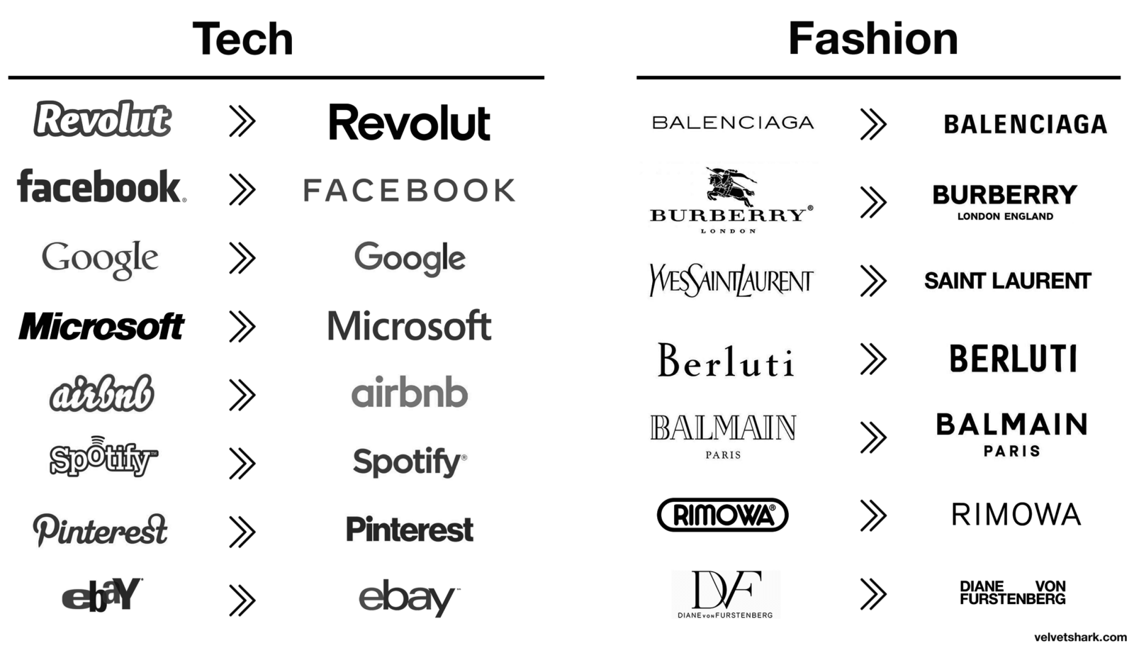
But in recent years, as with any cultural shift, we have witnessed the pendulum swing back in the opposite direction. This has been expressed most obviously in the style known as Maximalism:
Maximalism
Maximalism is all about excess and breaking the rules. Think bright colors, bold patterns, and textures. It’s about creating a sensory overload that captures attention and leaves a lasting impression. From packaging to social media graphics, incorporating maximalist elements into designs help a brand to stand out from the crowd.
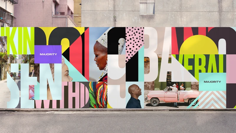
All brands want their marketing to stand out and leave an impression, but a successful brand understands our initial point: the business must guide the brand, and for most companies, it doesn’t make sense to go full-maximalist.
This has driven many businesses to embrace what our team considers to be the overarching theme of post-pandemic design; a compromise between originality and utility that we like to call Bold Minimalism.

Bold Minimalism
Bold Minimalism puts the focus on functionality with clean, striking designs. It strips away excess while expressing personality through the specific creative elements and styles we’ll dive into below, such as nostalgia, prominent photography, expressive fonts, branded illustrations, bright colors, gradients, etc. The result is a brand experience that’s intuitive and projects confidence and character.
Nostalgia
Nostalgia is a persistent and powerful tool in marketing, as evidenced by the constant recycling of styles from previous decades that somehow manage to “make a comeback” year after year after year. But Nostalgia also works as a subversion of ultra-modern simplicity. In the context of Bold Minimalism, traditional styles are channeled in ways that are more intentional and refined.
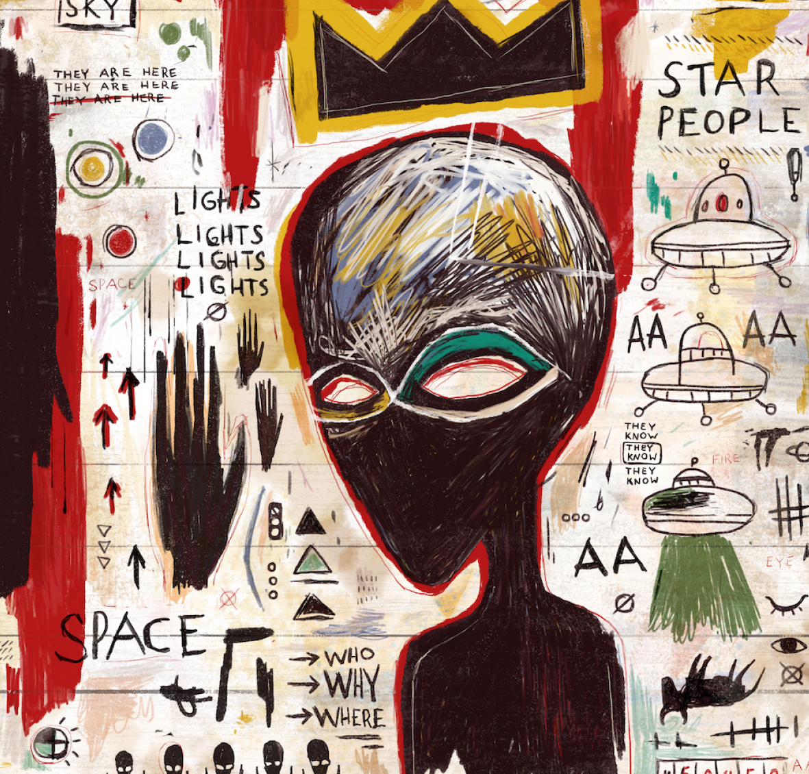
When History hired CMYK to design 70 NFTs based on hit series like Ancient Aliens, we created a series of original alien portraits inspired by famous art movements through history. This was a perfect expression of both the History brand and the series itself, which explores the idea that aliens may have visited us at various points throughout history.
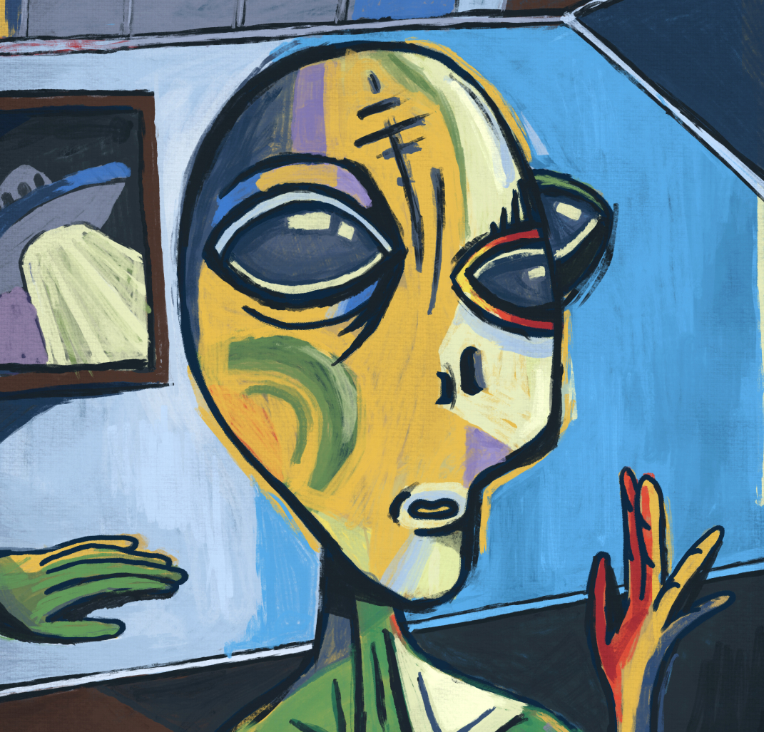
CMYK Lead Designer Larissa Ayestas drew parallels between recent Nostalgia trends in fashion and design: “Millenials and Gen Z seem to love Y2K and 90’s “anti-design” styles right now. Tiktok has done a lot to help revival trends like these blow up.” But just as the virality of social media fuels the rapid rise of new trends, so does it discard them for new ones. Instead of chasing fleeting trends, companies are better off channeling only the vintage designs that make sense for their brand and will stand the test of time.
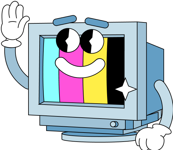
CMYK loves a healthy dose of nostalgia, where appropriate. Our retro cartoon mascot featured on our website is an adorable example of 90’s nostalgia. “Nostalgia feels comforting,” Larissa added, “I definitely find myself gravitating towards the elegance and familiarity of more traditional, condensed serif fonts this year.”
Expressive / Custom Fonts
For brands taking a Bold Minimalist approach, custom typography is the perfect way to differentiate themselves. Expressive fonts are designed to convey emotion and personality, adding a unique touch to break from the utilitarian sans serif mold. WMG is a great example– They worked with Pentagram on their rebrand, which included a custom typeface. This font incorporates the 67-degree angle into its letter form, echoing one of the core design mechanisms of the new logo.

Branded illustrations
Illustrations are another great way to add personality to branding materials. These are designed to capture the essence of a brand and create a cohesive visual identity. Our branded illustrations for Reddit’s Snoo Summit are a perfect example:

Prominent photography (& video)
Featuring photography and video prominently on websites and marketing materials helps retail brands direct focus to their product while expressing personality with a grounded, human quality. With a stellar in-house production team, CMYK is always ready to get behind the camera to capture original photo/video elements to incorporate into our clients’ designs, whether it’s a hero image on a website or a stunning product shot on social media. Blending these elements with graphics is also a great way to reinforce brand identity across mediums.
The new-and-improved CMYK website was designed to put the focus on our work. Even the case studies of projects that didn’t involve physical media production still use video sizzle-reels to showcase the awesome websites and design elements created.
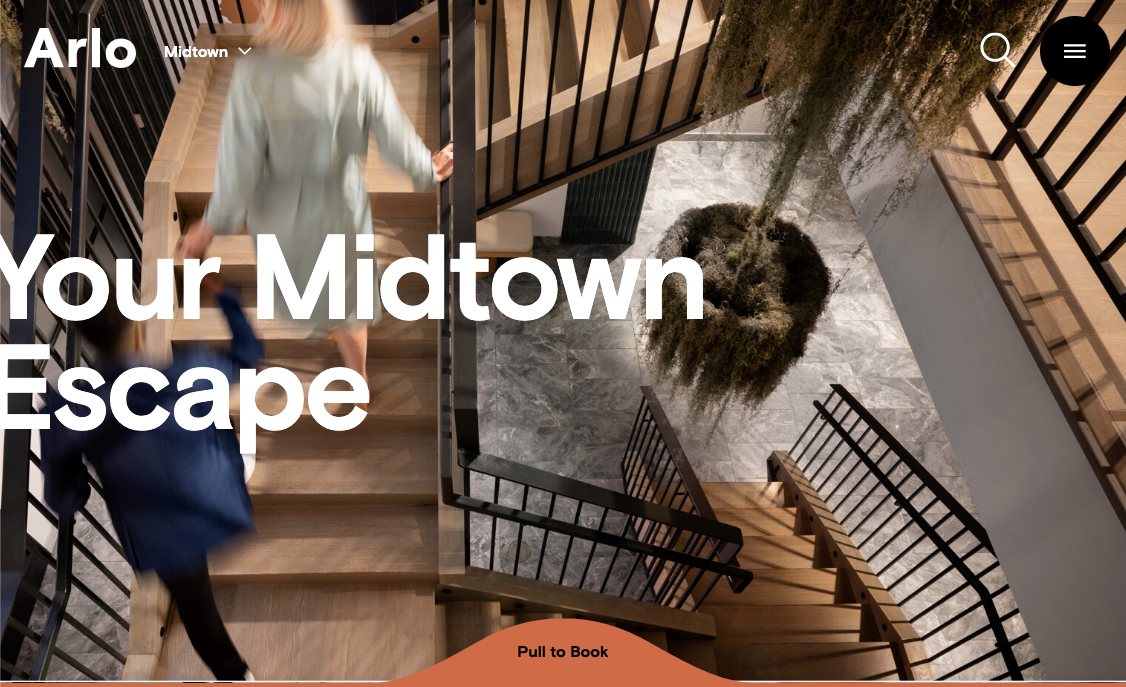
CMYK’s website redesign for Arlo Hotels is also a great example of photo-forward design that emphasizes their fun and stylish spaces that appeal to their clientele (professionals in their mid-late twenties).
Motion Graphics
Tasteful and precise motion graphics add visual interest to marketing materials and websites. From animated logos to brand illustrations, we love to incorporate motion graphics into our designs to capture audience’s attention and convey information in a fun, engaging way. The trick is to not go overboard (unless the client wants maximalism), and let brand guidelines inform the types of motion graphics used. When CMYK applied WMG’s newly rebranded guidelines to their website, we incorporated that special 67-degree angle we mentioned to inform the shapes and animations and help express their innovative originality among the major record labels. And when CMYK created a malleable brand identity for United Against Nuclear Iran (UANI) to communicate the summit’s crucial messaging, we began with recognizable shapes, patterns, and colors- providing both symbolic and literal way-finding markers for event guests that could be animated in an intuitive and visually compelling way.

Bright / Bold Colors
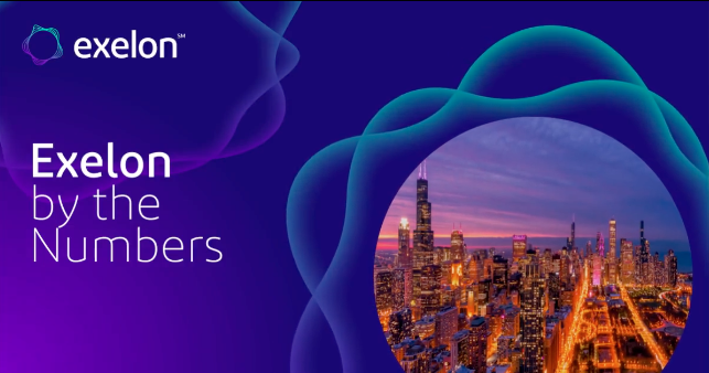
Brands finally realized that “Greige” is not a palatable color palette in this day and age and are embracing bright colors for a more confident and attention-grabbing identity. CMYK clients Zoetis and Exelon are great examples of brands leaning into this theme, using their orange and blues to infuse their messaging with different emotions while directing visitors’ attention in a very intentional way.
Notable Mention:
AI Generated
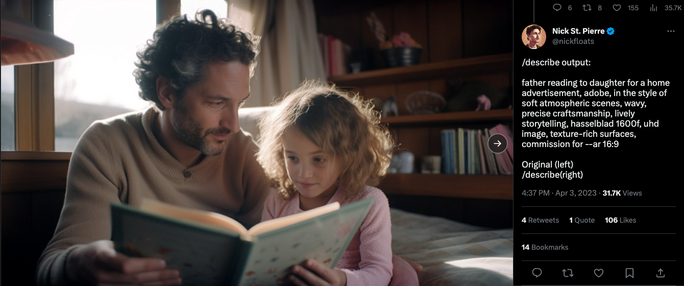
Let’s not ignore the elephant in the room; AI is more of a trend in Design workflow as opposed to a stylistic trend, and while apps like Midjourney and Stable Diffusion are still too unwieldy to rely on, there’s already lots of speculation and discussion about the disruptive impact these tools will have on the field of design, especially within brand marketing. Currently, these tools are best used for quickly providing inspiration, but we anticipate it will become common practice for designers to augment and streamline their workflow using AI by the end of year.
