Project Intro
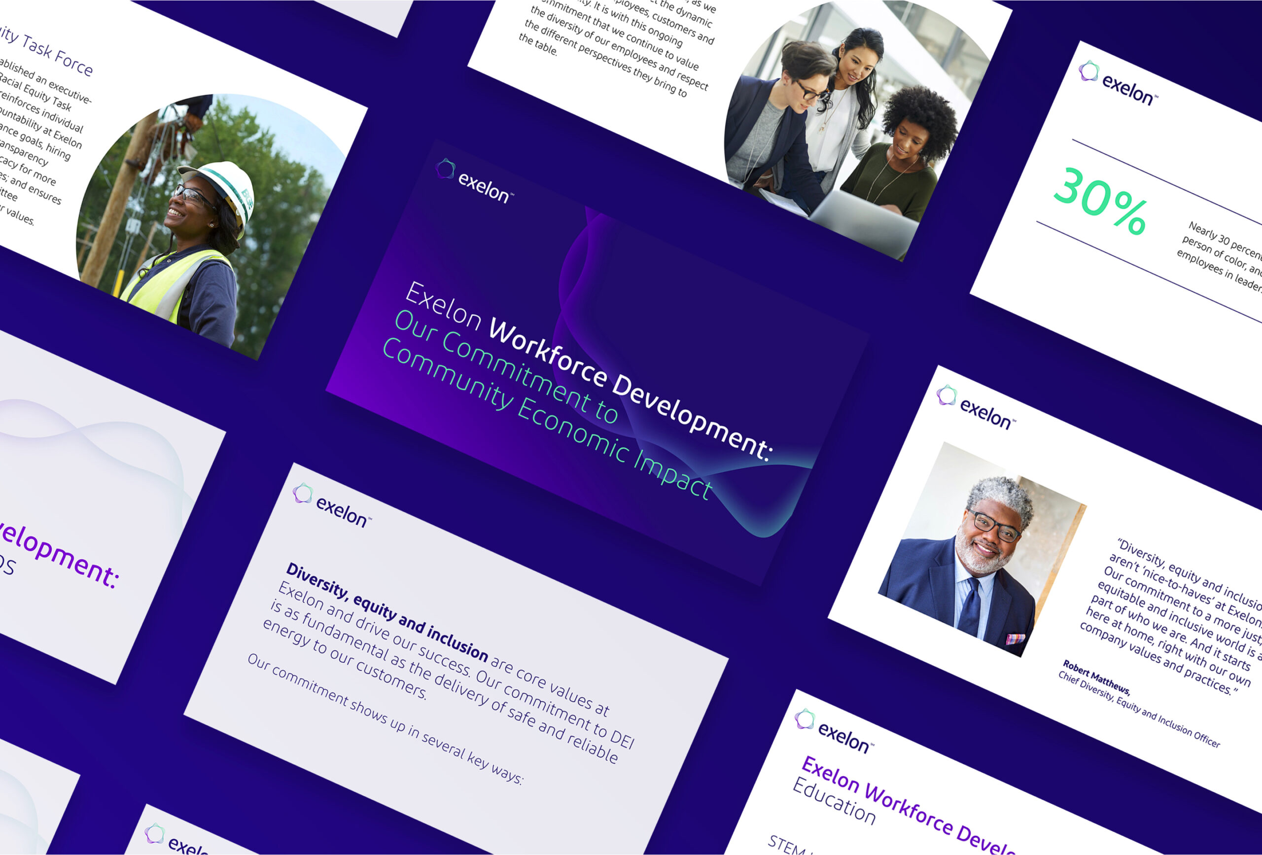
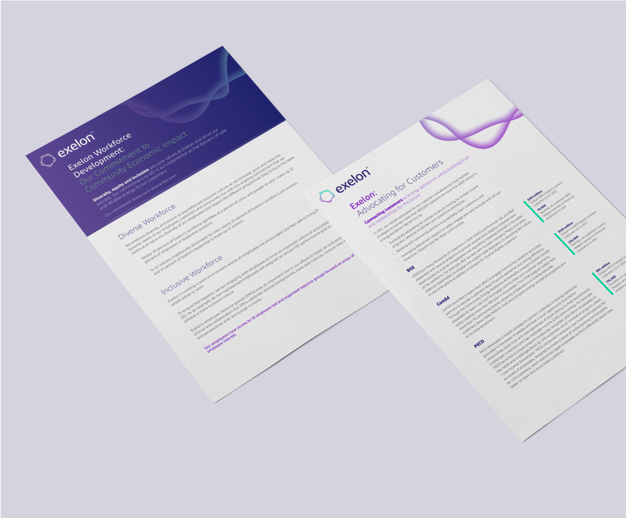
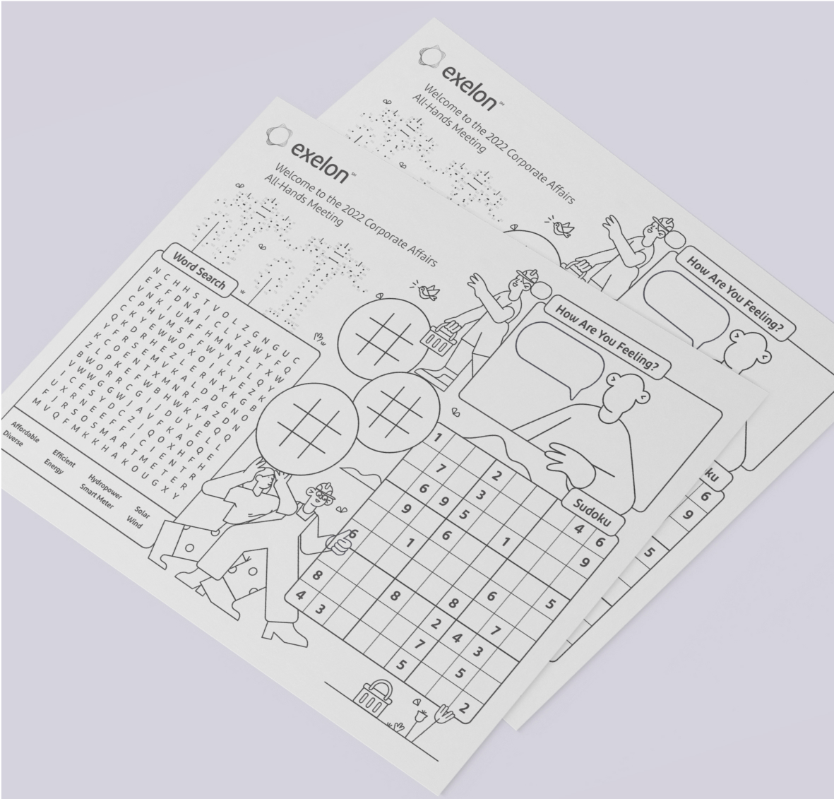
Having developed a striking new visual identity for its family of companies, Exelon hired CMYK for its praxis – applying new approaches to color, type, and visual motifs in a variety of mediums and applications. From internal presentation templates and philanthropic outreach materials to employee engagement collateral, we revised existing resources and created new ones with an energized flair.
Highlights
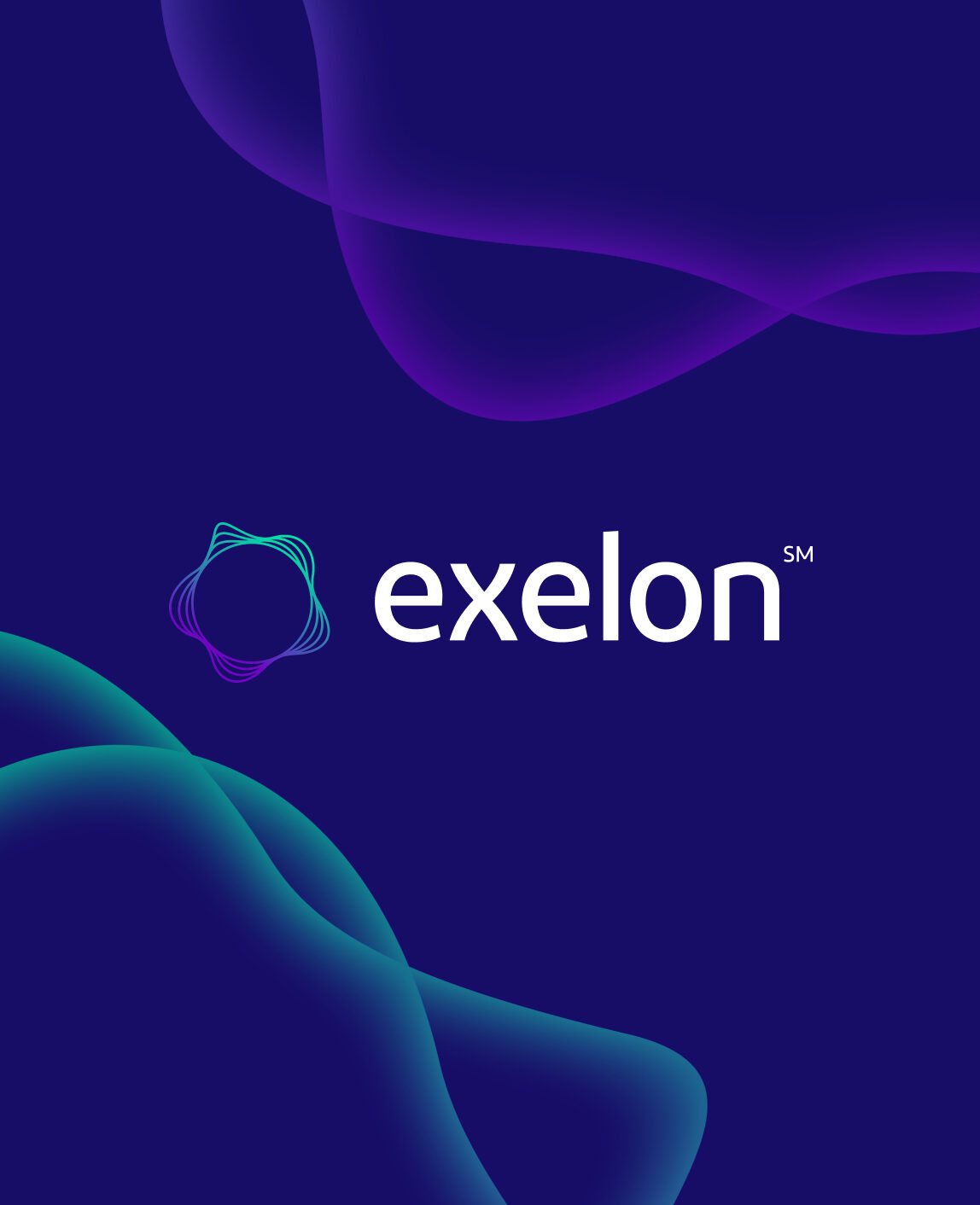
An exelon wave motif formed a basis for textural interest, in both static and animated applications. A functional color hierarchy provided a visual system indicating level of importance to support concise, intuitive messaging.

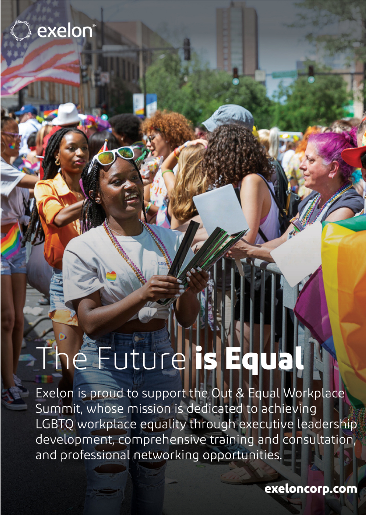
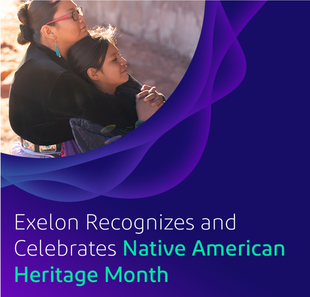
Special initiatives towards DEI-focused ERGs, community outreach, and humanitarian partnerships were accented with human-centric imagery.
As a large company, Exelon’s numerous subsidiaries required cohesive and intuitive adaptations of their new design framework. Through thoughtful and precise expressions of their brand system, we leveraged the touchstones of the company’s updated identity to build brand affinity, show its people, and clearly communicate their impact and objectives.