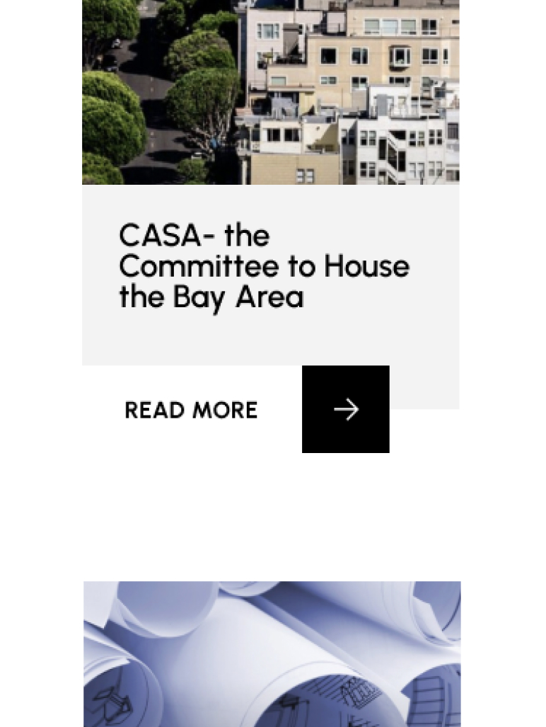
Project Intro
Keeping in mind the housing advocacy organization’s mission- prioritizing access, education, and advocacy- we blueprinted and built a full site renovation for the Silicon Valley’s equitable housing authority and produced video content to help tell their story.
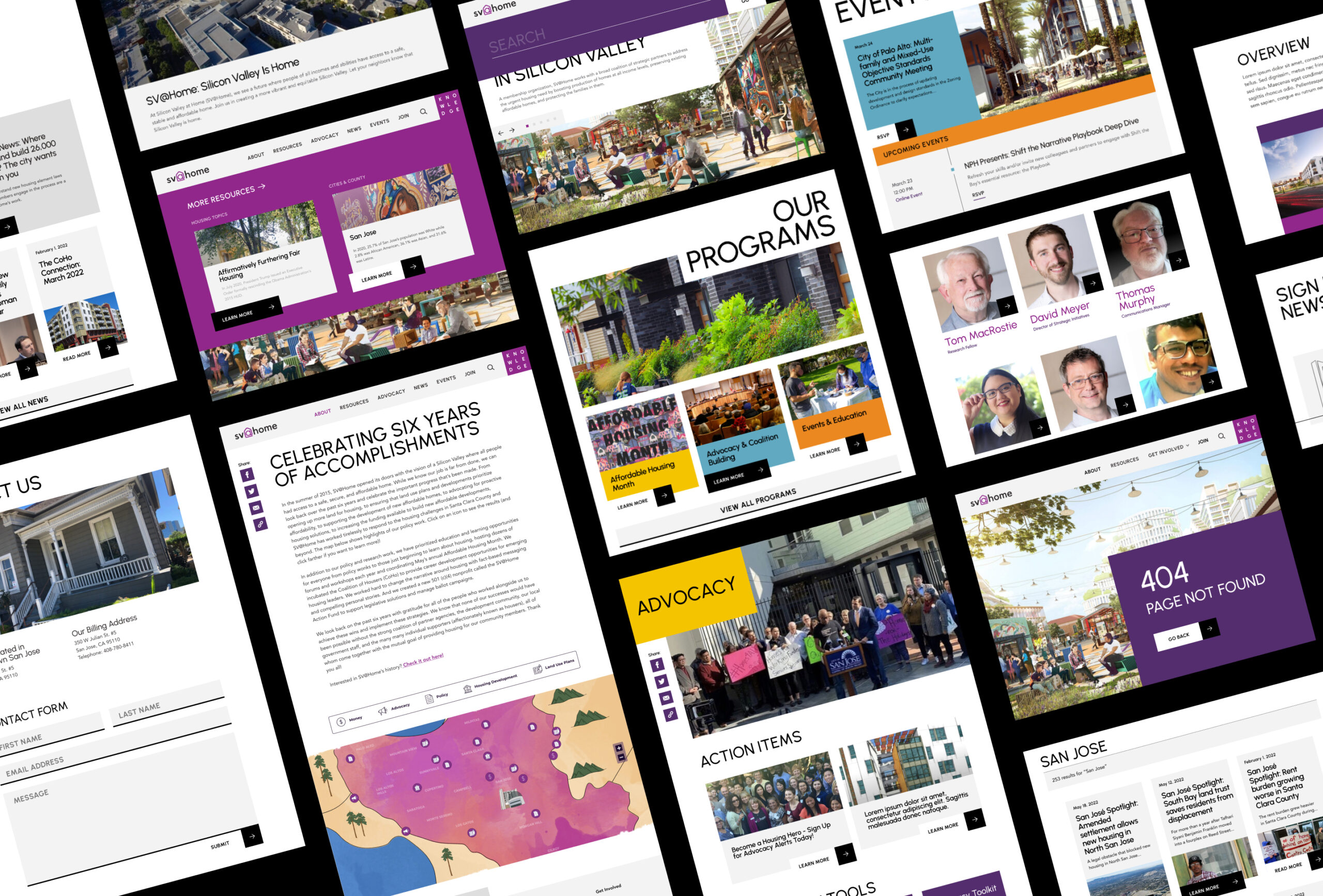
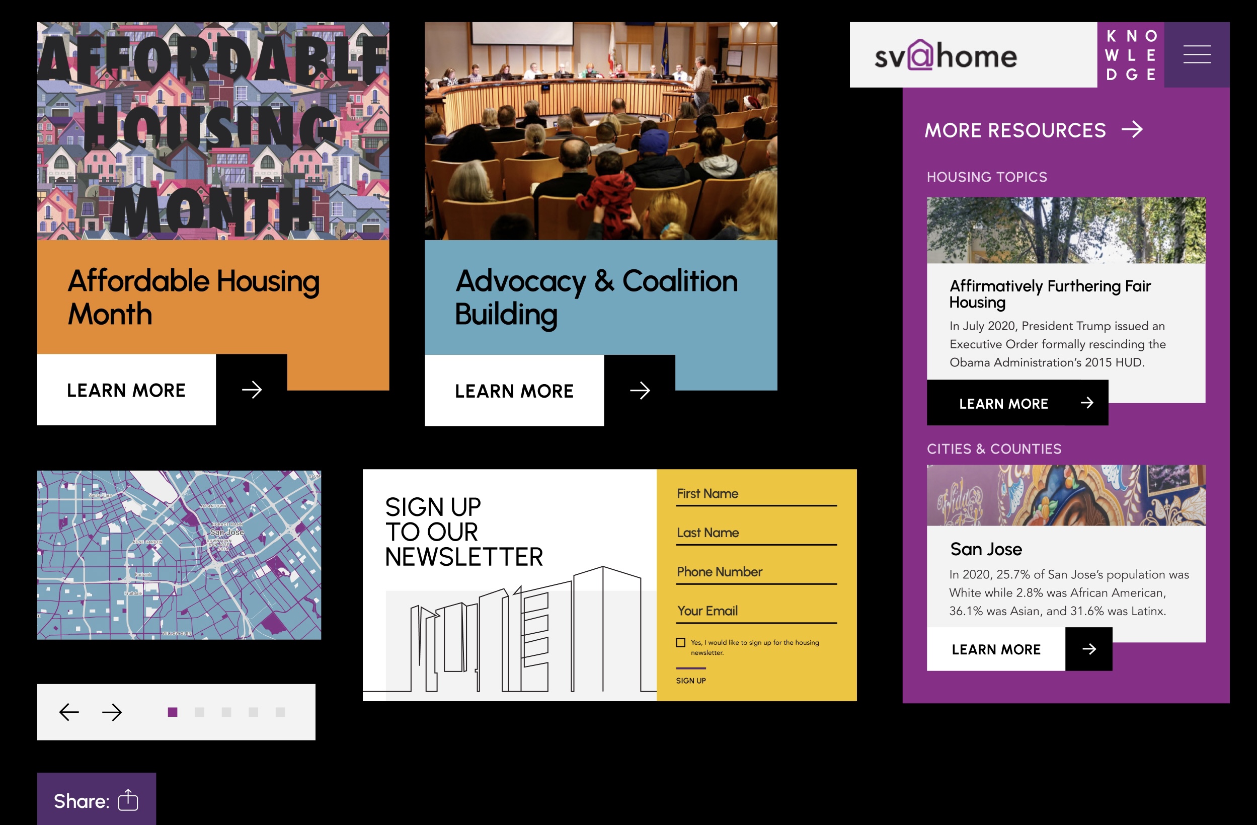
The organization’s variety of housing advocacy resources are vital to their community- so we placed them front and center.
highlights
We also reorganized their extensive library of resource content to enhance its searchability, and simplified the taxonomic organization of their knowledge base to ensure that crucial information is easily accessible.

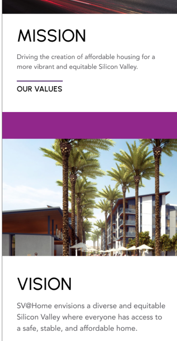
We expanded on the organization’s brand identity, using its color palette as a functional guide to improve visual interest across the site.
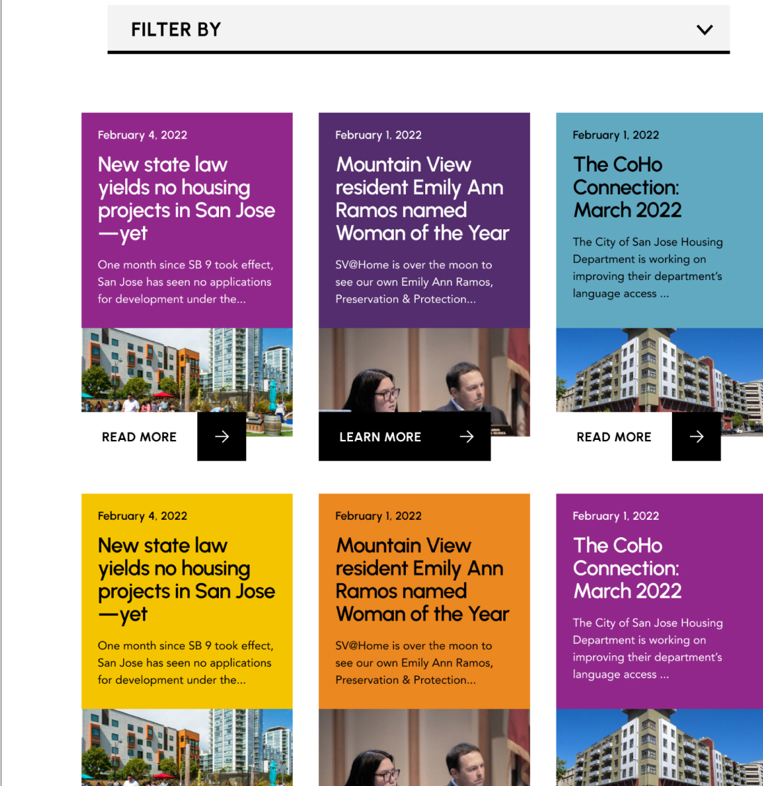
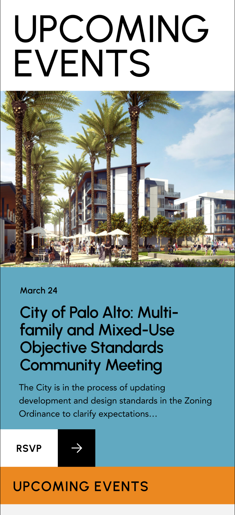

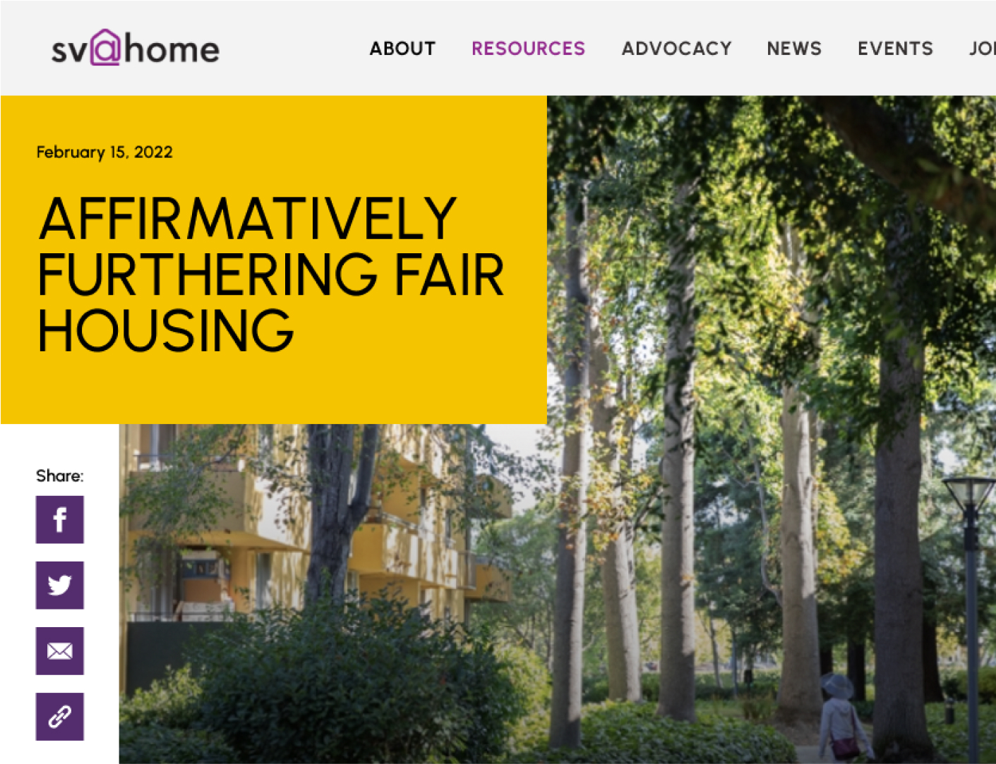
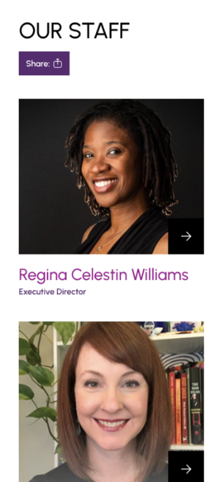
By subtly associating color with function, we intentionally created a highly engaging web environment. Color both generates interest, identifies like content, and provides anchor points for users as they navigate the site. Large, impactful imagery gives meaningful context to pertinent information- so we designating extra space for rich media presentation on any device.
The site’s former CMS left a lot of flexibility to be desired- so we leveraged new capabilities in the WordPress framework to create an environment that was more intuitively editable.
Essential building blocks with bespoke variations created an editing system that both ensured visual continuity, and left room for multiple approaches to media presentation and data visualization.