Project Intro
Project Intro
Hôtel Swexan is a new luxury hotel in Dallas developed by Harwood International where “Swiss hospitality meets Texan charm.” Featuring
gorgeously-outfitted suites, multiple restaurants, and an impressive list of amenities, the hotel is both a must-visit destination and vibrant cultural hub in the
city’s burgeoning Harwood district.
highlights
highlights
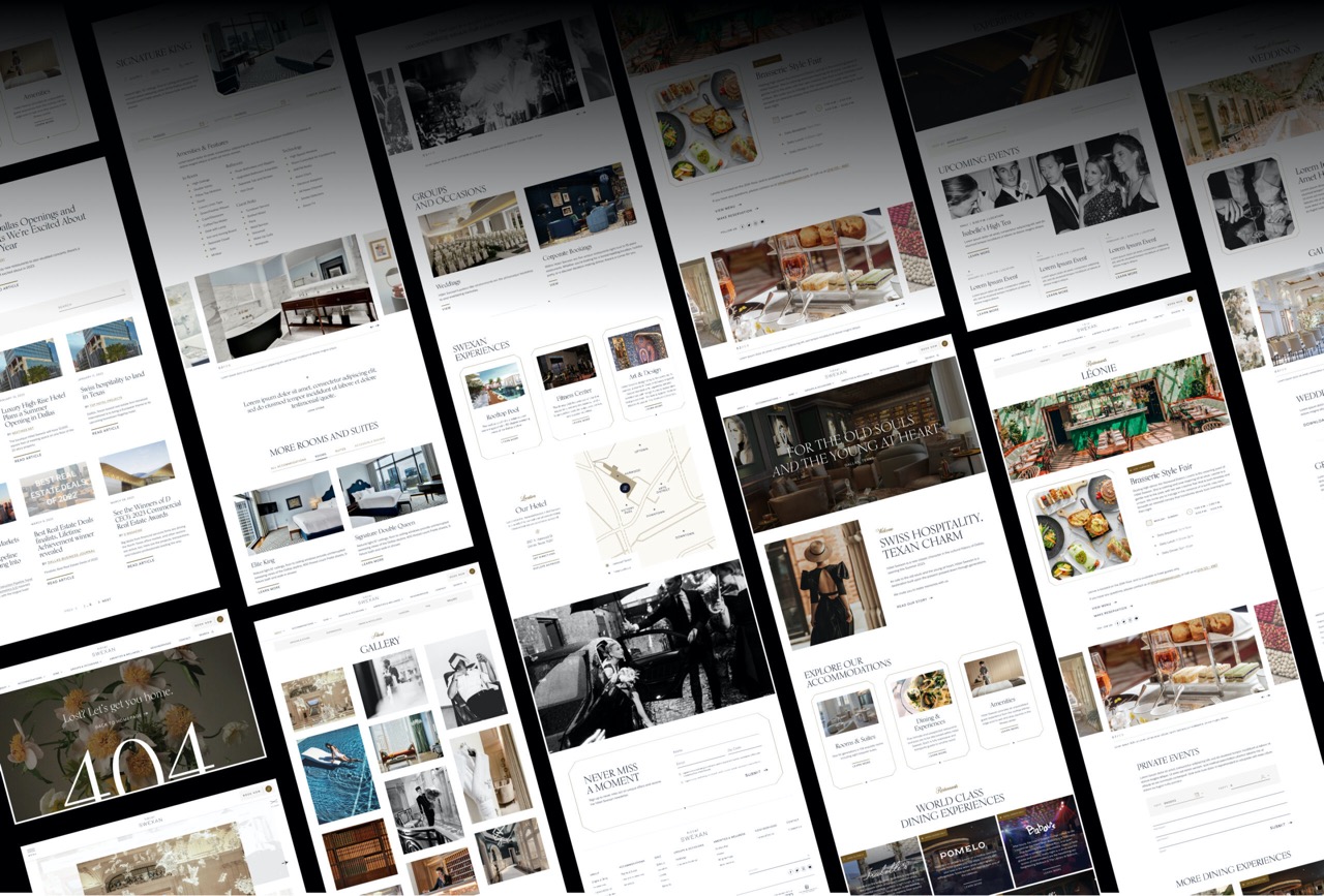
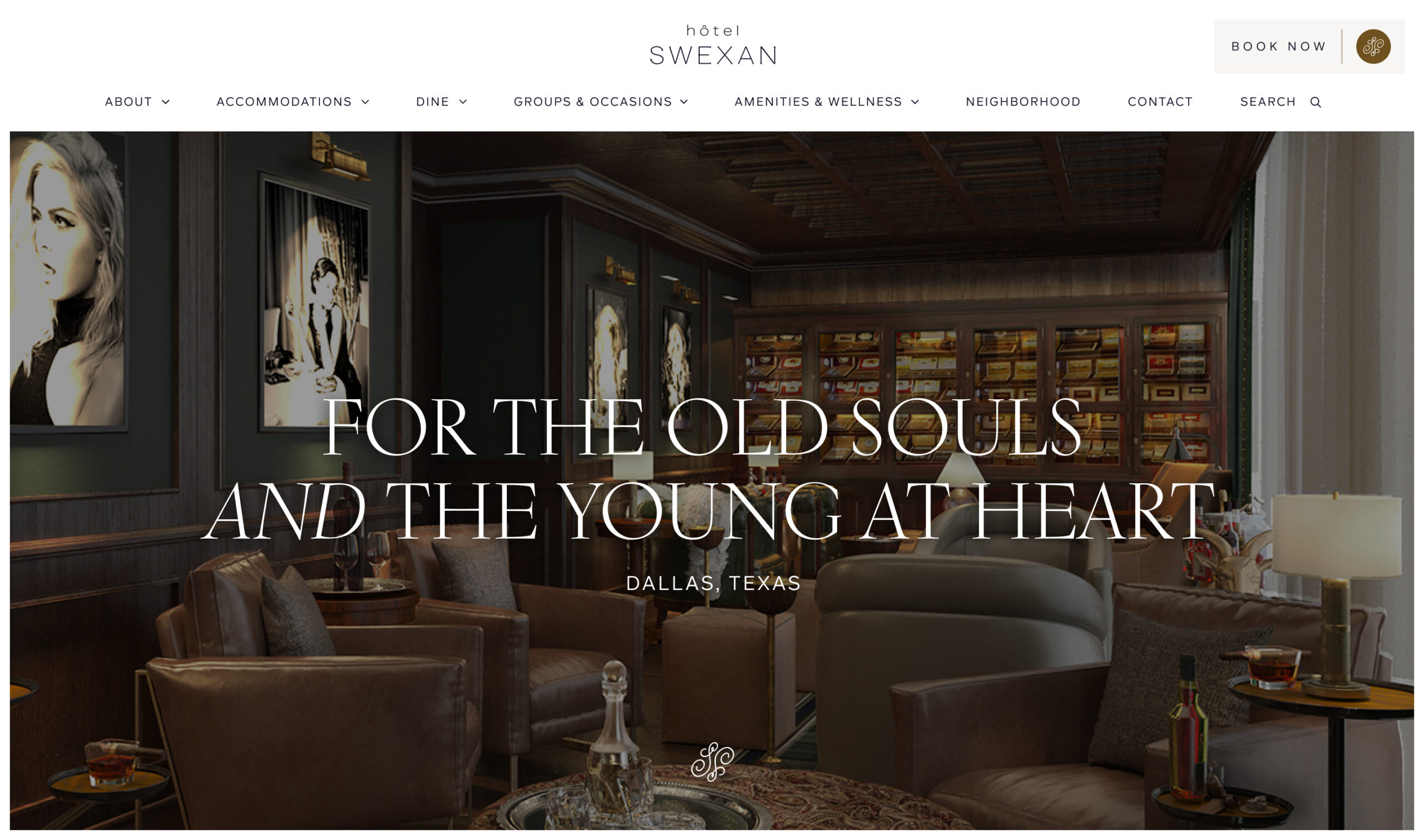
Ahead of Hôtel Swexan’s grand opening in June 2023, CMYK used their unique brand identity to inform the creation of hotelswexan.com. The site features an
integrated booking engine and highlights the hotel’s offerings and included a pre-opening placeholder site. The visual language we developed focuses on
luxury and ease of use to drive bookings, and we supplemented the core functionality with event booking, neighborhood highlights, and an easy-to-browse
overview of hotel accommodations.
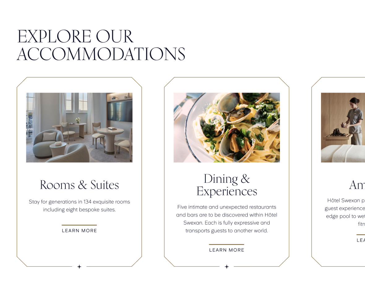
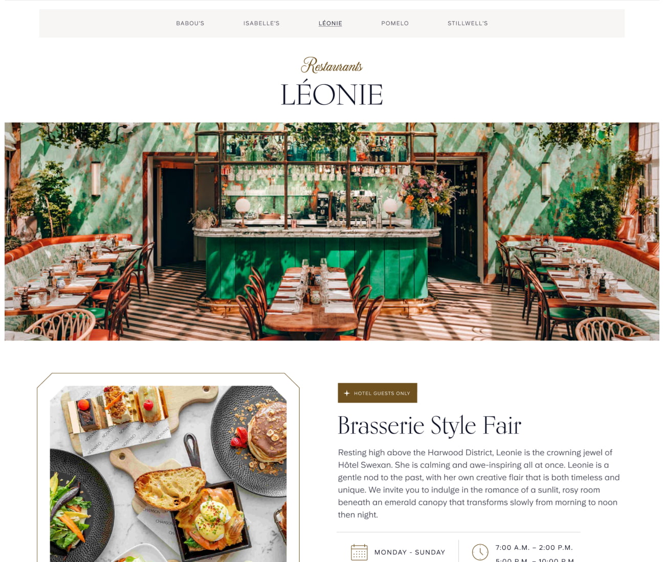
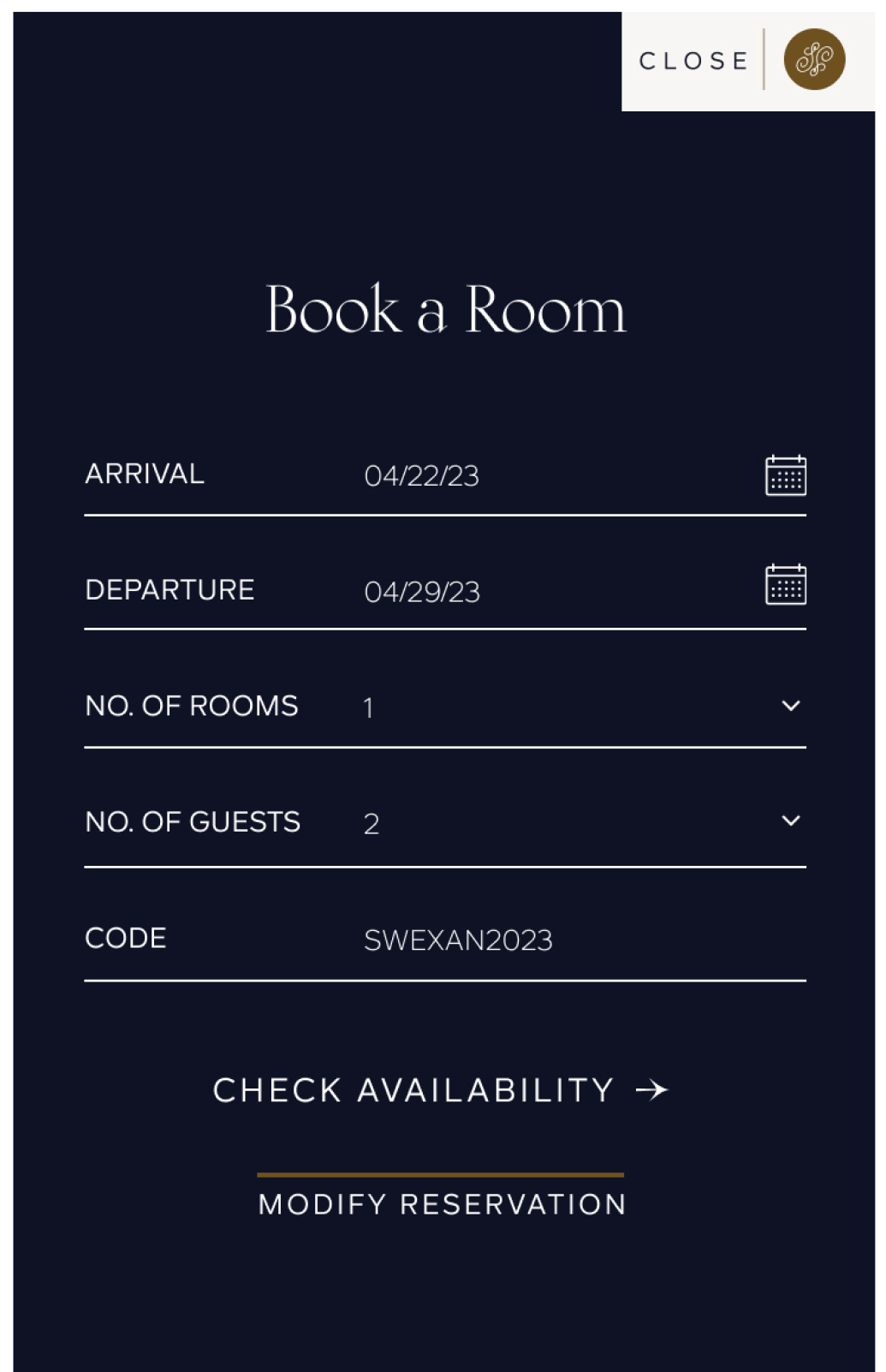
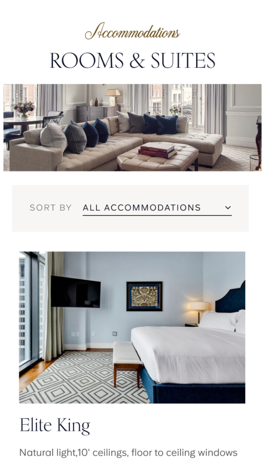
The site’s architecture is carefully designed to provide a seamless and accommodating user experience. Connections between the various pages and an
intuitive sitemap header provide a comprehensive overview of hotel amenities, accommodations, hotel happenings, and dining venues, and a persistent
call-to-action ensures that booking a room is always just one click away.

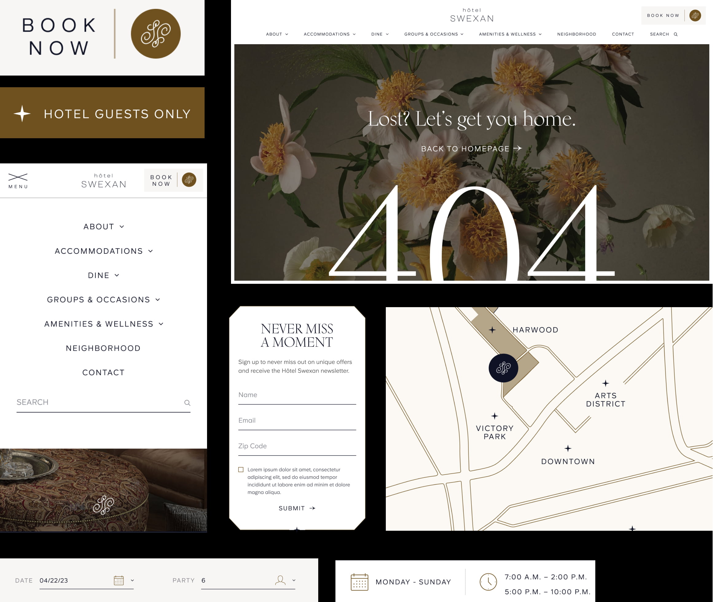
Given that this was a new property, we made sure to establish and reiterate the hotel’s unique brand identity inspired by the Swiss-Texan heritage of its
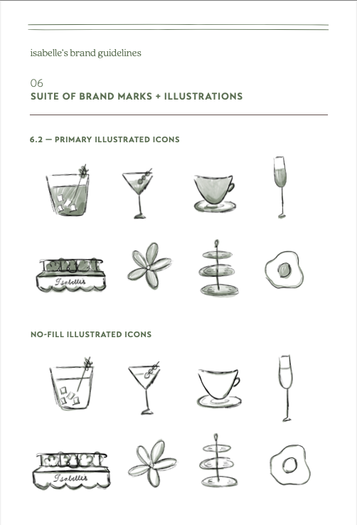
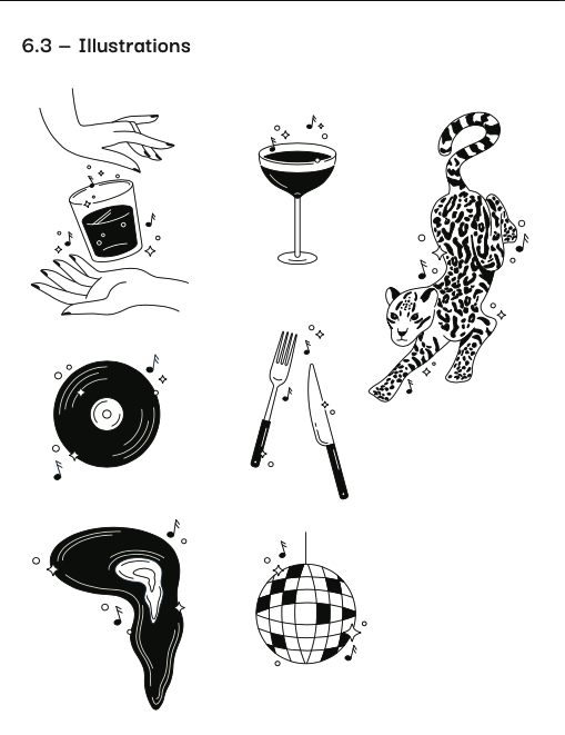
owners. This informed the site design and aesthetic choices throughout, with visual iconography and motifs serving as both decorative and functional
touchpoints to encourage lasting recognition.
highlights – Brand development
highlights – Brand development
Hôtel Swexan also enlisted CMYK to develop branding for their two upscale restaurants and nightclub located at the hotel. These spaces were intended to
cater not just to hotel guests but also local patrons and revelers.
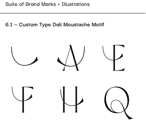
Based on the client’s general ideas and preferred clientele, we built brand expressions for these three new establishments from the ground up. This was an
iterative, collaborative process with their team as we fine-tuned each space’s visual identity and translated it across a variety of physical and digital collateral
including menus, iconography, social media templates, newsletters, etc.
In order to help build brand recognition and affinity for these new businesses, we created unique personas with their own voices for all three restaurants and
brought these characters to life through a variety of physical and digital collateral and copy.
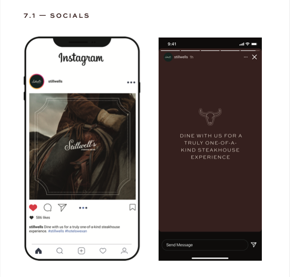
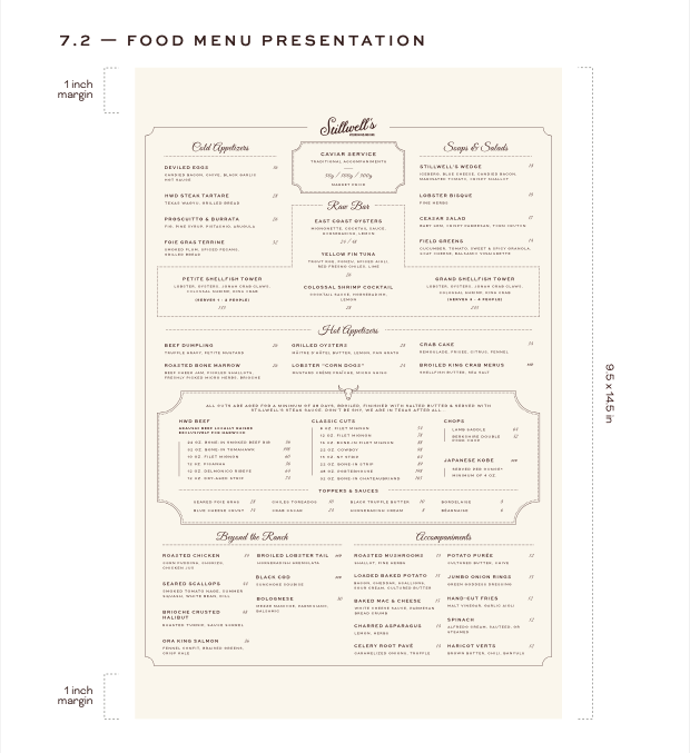
We also developed microsite landing pages for the two restaurants and wrote copy for each. The goal was to align the physical spaces and branding with
their digital presence. We took great care to translate the ambiance & aesthetic we helped to develop across these web pages and digital collateral in order
to give potential customers a vivid and enticing picture of what each space has to offer.
One challenge that was baked-in to this project was the hard deadline, which was based on the construction & launch of the hotel itself. We had to be efficient
in order to complete the brand development and launch of these microsites in time. Thanks to our flexible, team-player mentality and collaborative approach
to each project, this challenge was accepted and easily surmounted!
