Project Intro
Qwiet leverages the latest in AI and machine learning to provide best-in-class cybersecurity defense systems. They offer their customers peace of mind knowing their data is shielded from the latest cyber threats.
Qwiet had recently rebranded, adopting a new name, visual identity, brand language, and product interface, and they called on CMYK to take these new elements and help tell their story.
highlights
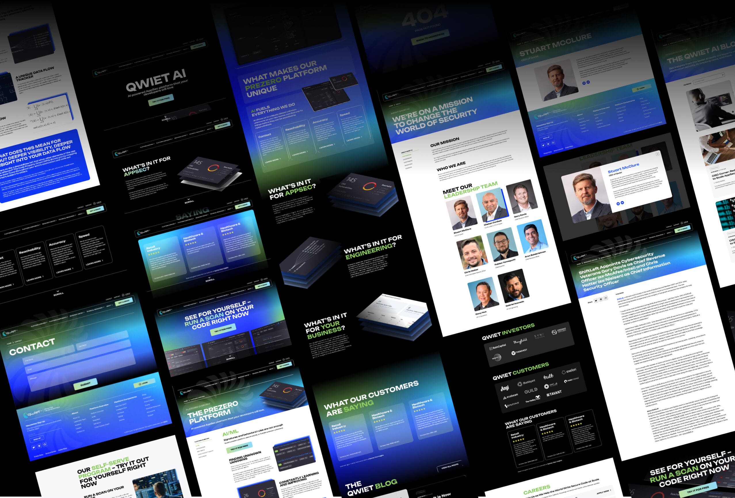
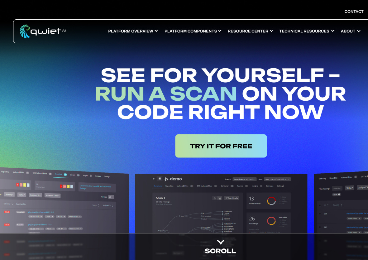
We revamped their homepage into a comprehensive product overview that clearly explains Qwiet’s offerings and illustrates their competitive advantages to help convert potential partners who visit the site.
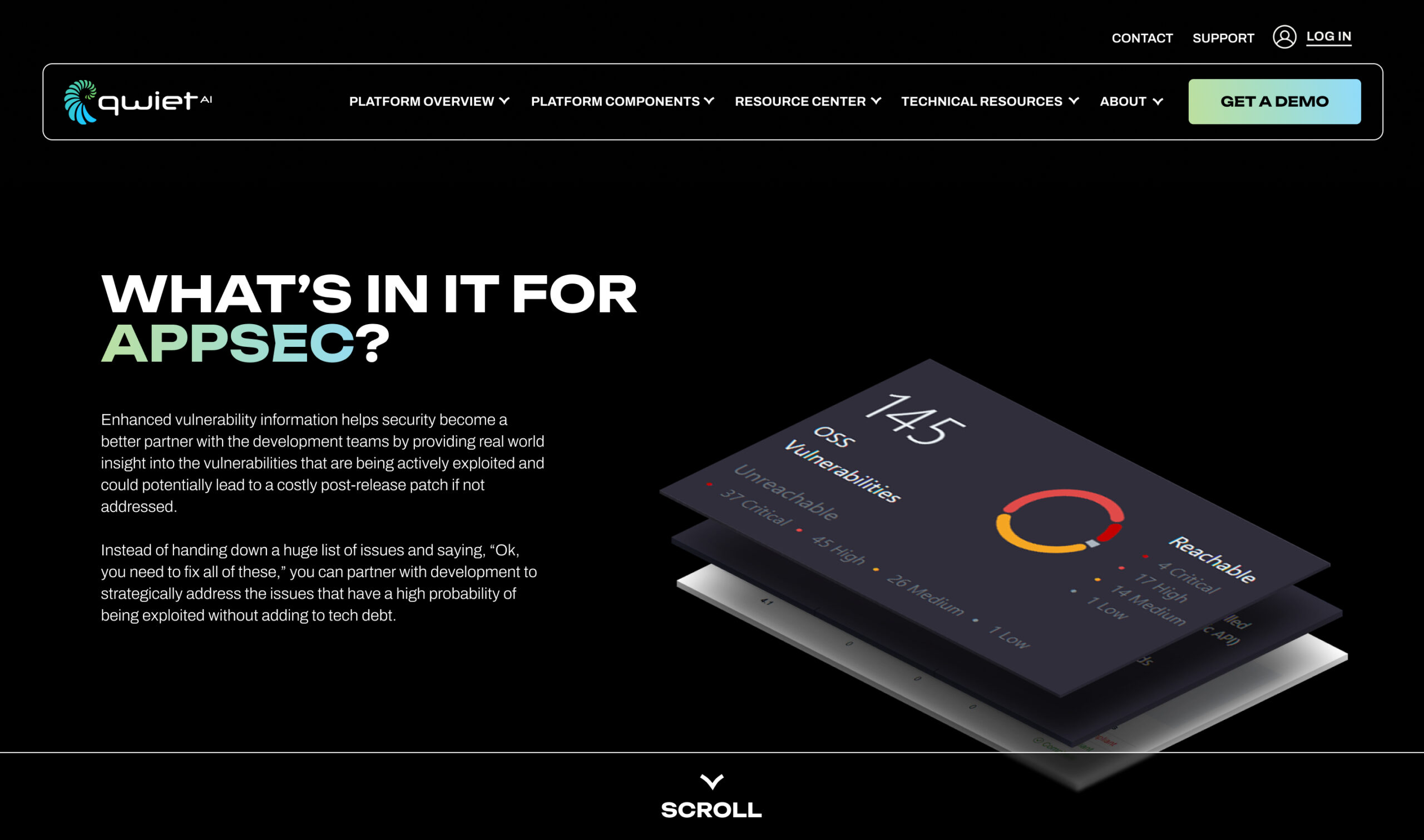
As an innovative leader in their field, Qwiet deserves brand recognition, and that’s what we sought to help them achieve. To that end, we turned their spiral logo into a visual brand motif that evokes the golden ratio, one of nature’s most iconic shapes. This likens Qwiet’s product to an impenetrable shell that provides layers of protection for customer data.
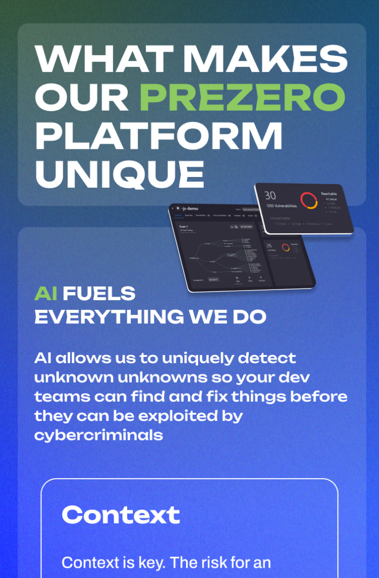
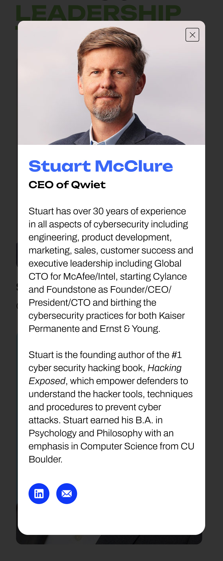
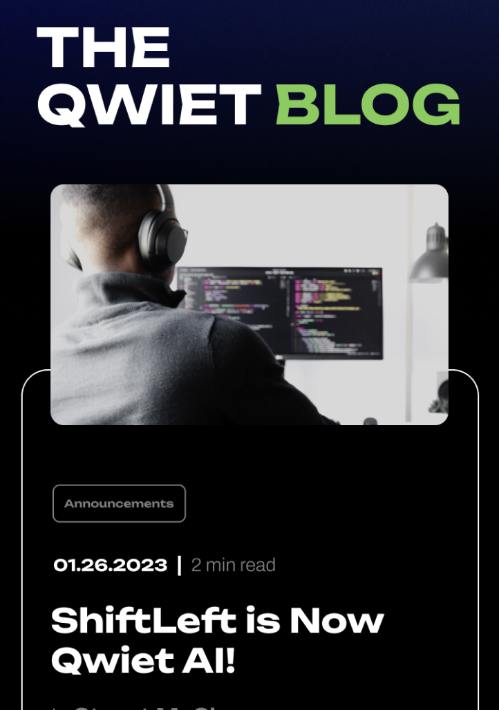
Additionally, we applied brand motifs, shapes, and textural code to the homepage’s scrolling narrative to introduce potential clients to the product’s UI. We also used diagrams that show the brand’s major tenets of accuracy, reachability, context and speed ‘wrapped’ by AI to illustrate the unique ways in which each of these features are powered by the latest technology.
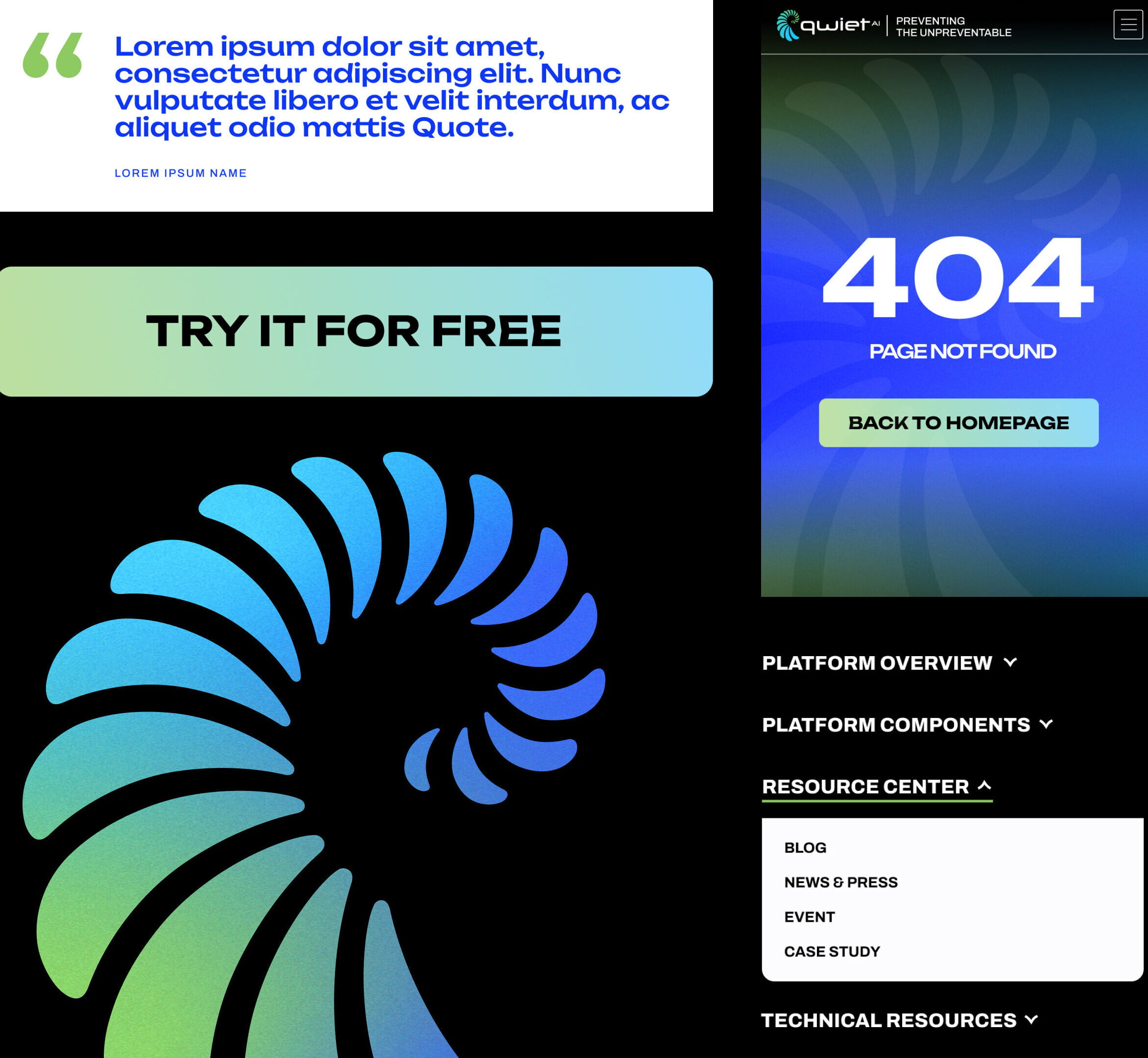
By focusing on Qwiet’s innovative use of AI in their product’s security auditing processes, we created a home for content that’s both informative and visually captivating that speaks directly to potential customers.
