Project Intro
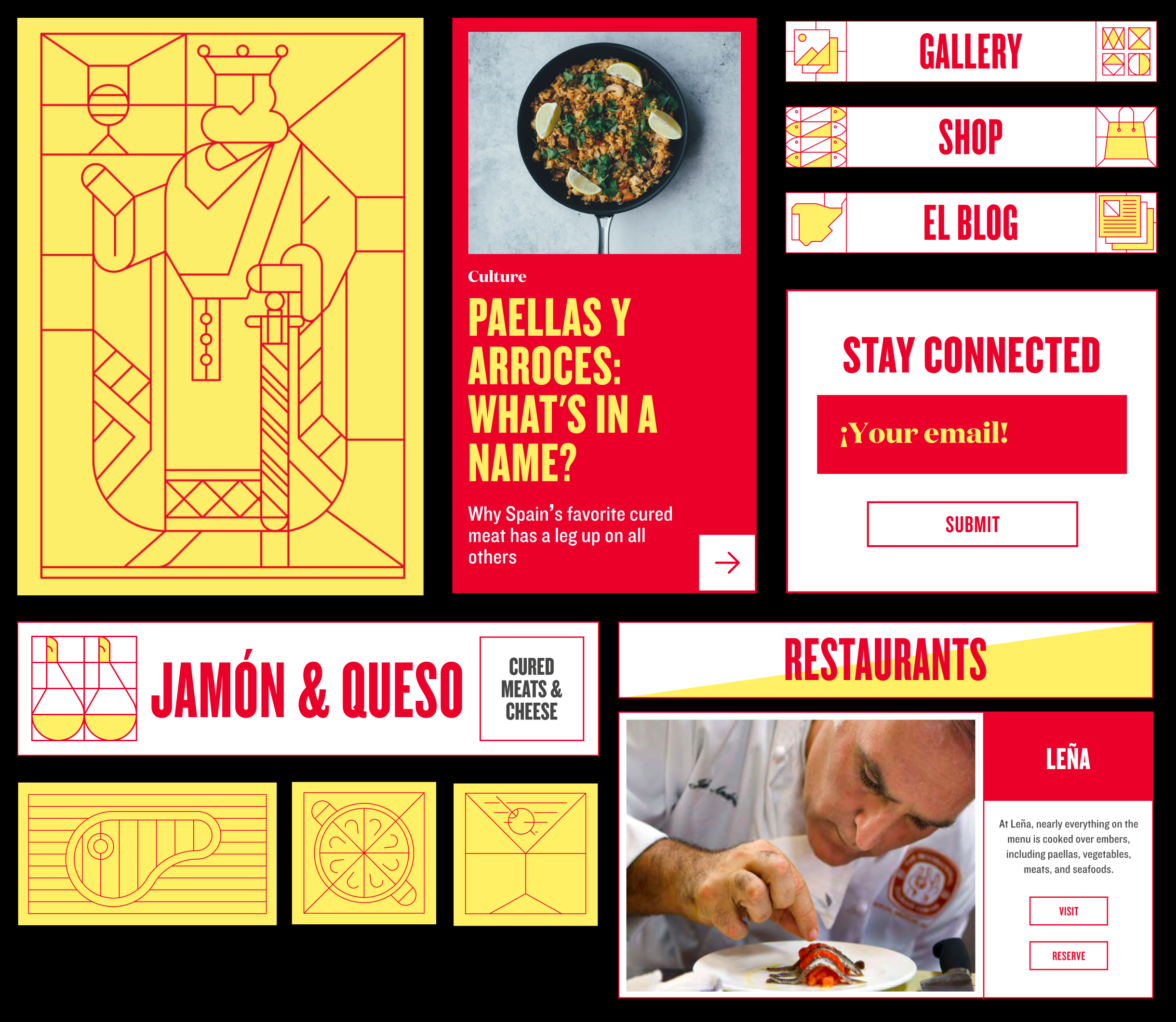
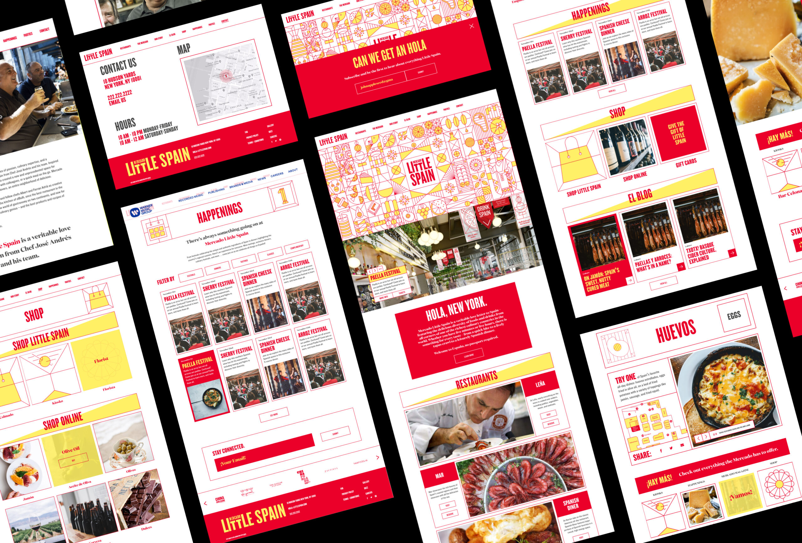
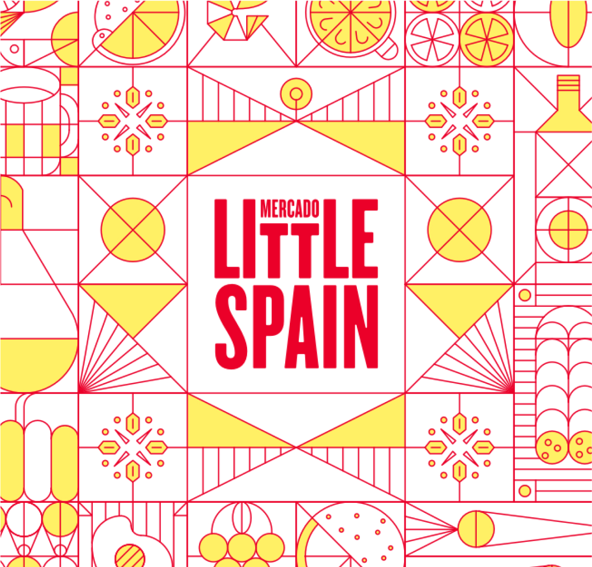
Andrés’ ThinkFoodGroup came to us with a massive amount of design collateral, including unique logos and brand guidelines for each individual restaurant and bar, stylized design elements reminiscent of Moorish tile, and fonts and typeface, and asked us to coalesce these varied pieces into an approachable and beautiful whole.
highlights
Partnering with the fabulous team at BentoBox—a new content management system that specializes in restaurant websites and content—CMYK took these patterns, signs, and colors and used them to evoke the style and passion Andrés’ project, so that the digital home for Mercado Little Spain truly becomes an extension of its physical space.
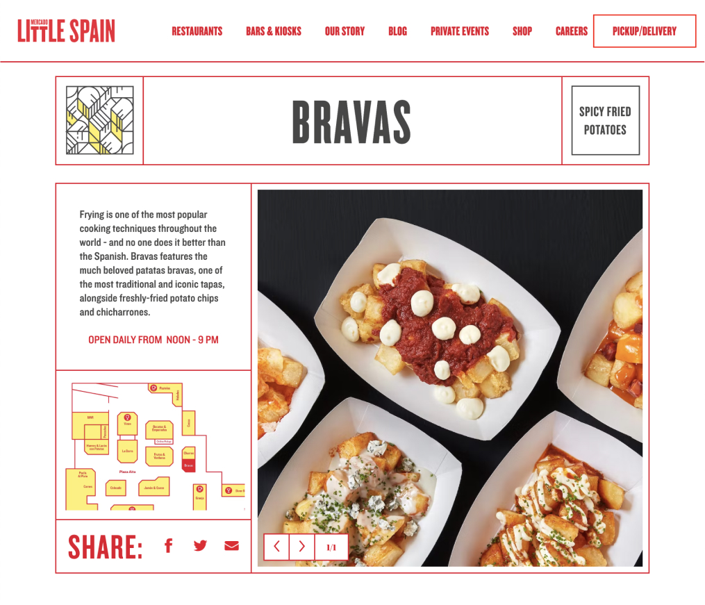
Realizing that the website would also serve as a visitors’ guide for the marketplace, we also designed and developed a fully interactive map for people to both plan their trips from home and guide themselves within the hall using their mobile devices.
And finally, as with all our web projects, we also made a point of designing and developing in full compliance with ADA rules and regulations, so that the site is user-friendly and accessible to all. That’s just the CMYK way!
