Project Intro
The Kenyon Review is a storied literary magazine based in Gambier, Ohio, home of Kenyon College. The publication’s history boasts works by some of the great icons of American literature, amplifies new voices across genre through its quarterly journals, and—under the auspices of Kenyon College—provides creative space for writers through regular workshops and events.
highlights
In 2022, the Kenyon Review approached CMYK with more than a simple web refresh in mind: in tandem with a massive archival project of the journal’s back issues, the publication sought a new model for subscription and engagement to bring its rich, engaging print catalog to its digital audience while also allowing for the presentation of its contemporary work in a manner more visually consistent and easily navigable.


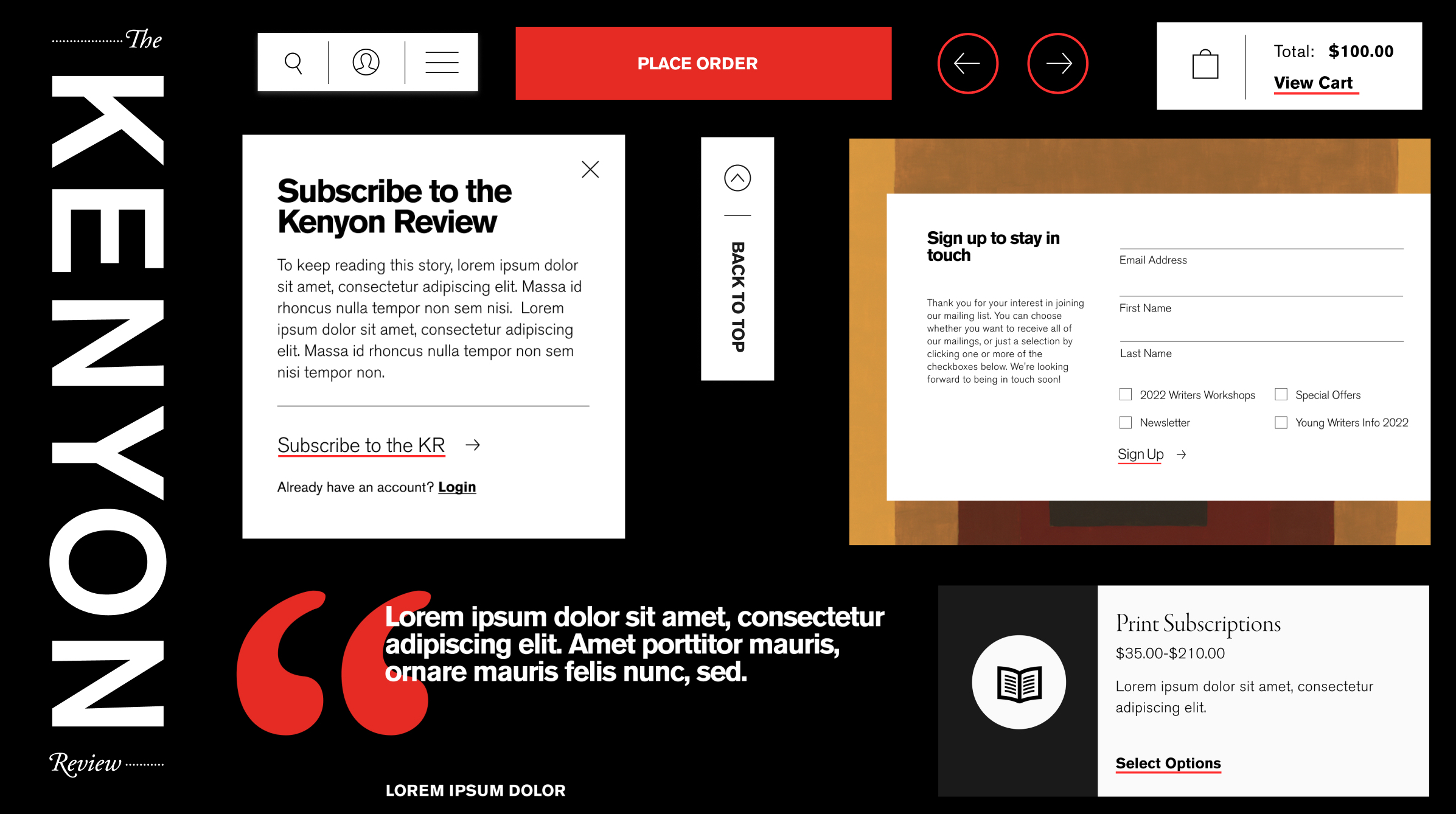
As the publication’s entire database of archive work was digitized, we implemented a reader registration wall with built-in perks like a reading list, independent account management, and easy access to subscriber options, encouraging meaningful engagement and key conversions by providing reader incentives.


A built-in, programmatic approach to website color allows the latest physical issue of the journal—whose covers have dedicated featured art and artists—to become a global background texture for the site. Using a pared-down native color scheme, the site’s overall impression refreshes with each new issue.

The site’s administrative functions were also powered up with customer management tools and a dedicated editing system for editing published archive work. As literary work requires careful annotation, styling, and layout flexibility, we created a system that allows the site’s digital editors to display work in the manner intended by authors.


