Project Intro
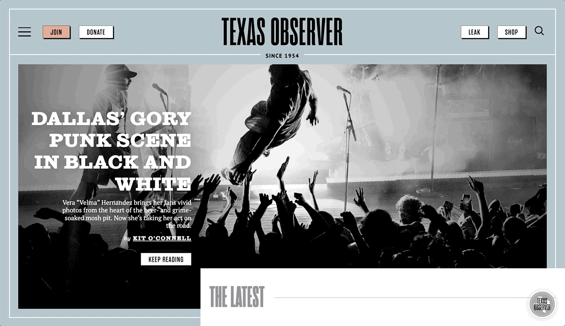
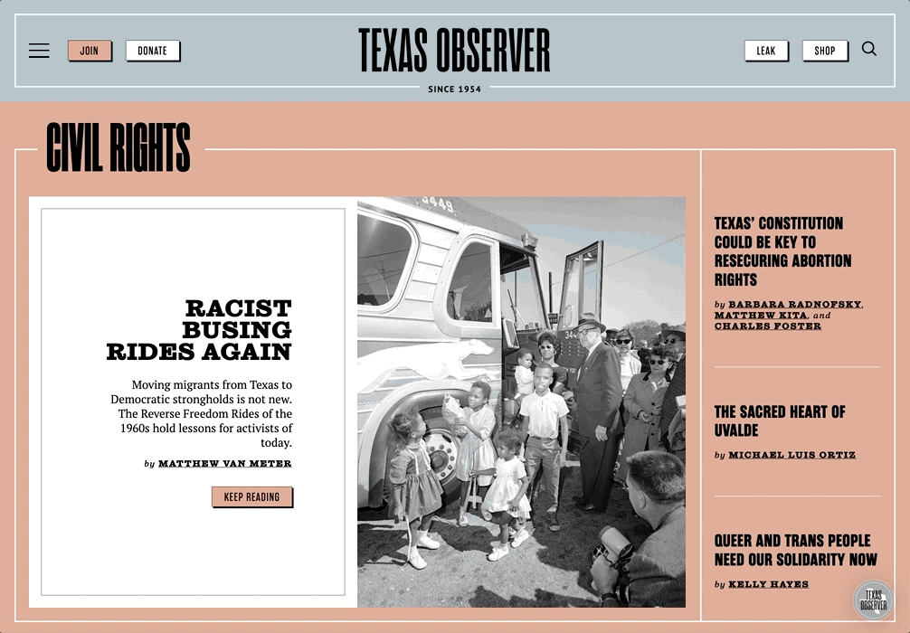
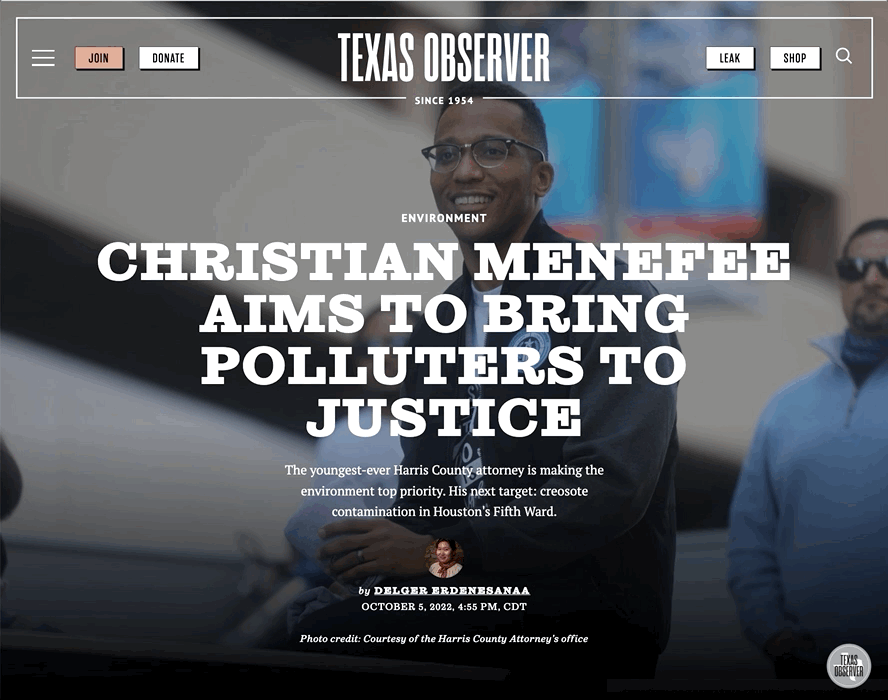
Online since 1997 and without a major redesign to their site for nearly a decade, the Observer was in need of not only a new digital expression of their brand, but also a major restructuring of their content and overall user experience and interactivity (both for front-end users and their editors on the back-end). From a design perspective, the result was nothing less than a night-to-day change, with a strong digital language infused throughout the site and the ability for the editorial team to create new content and revitalize old content in ways they had never been able to do before, such as changing the color themes of the site to match their most recent print editions, highlighting featured and high-profile stories in a special and premium template style, and categorizing content according to new and improved schemata.
Highlights
One of CMYK’s favorite types of projects are ones like these: large, editorial platforms with a rich history, identity, and sense of purpose…and, in the case of the Observer, a massive and idiosyncratic database of content going back all the way to their very first print issue in 1954.
Prior to our redesign, there were, essentially, two Observers: the digital-centric and the historical, print iteration. While the latter had been scanned into a digital format and were hosted online, they were only connected to the main web platform via a series of separate databases, making it non-intuitive to access.
As part of our process, we made sure to bring these databases together for the first time, to give people the seemingly simple but hitherto impossible ability to search the web and print archives through a single channel, and thus provide ready access to the full breadth of material generated by the Observer’s esteemed staff over the years.

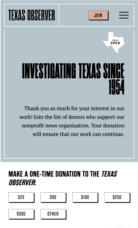
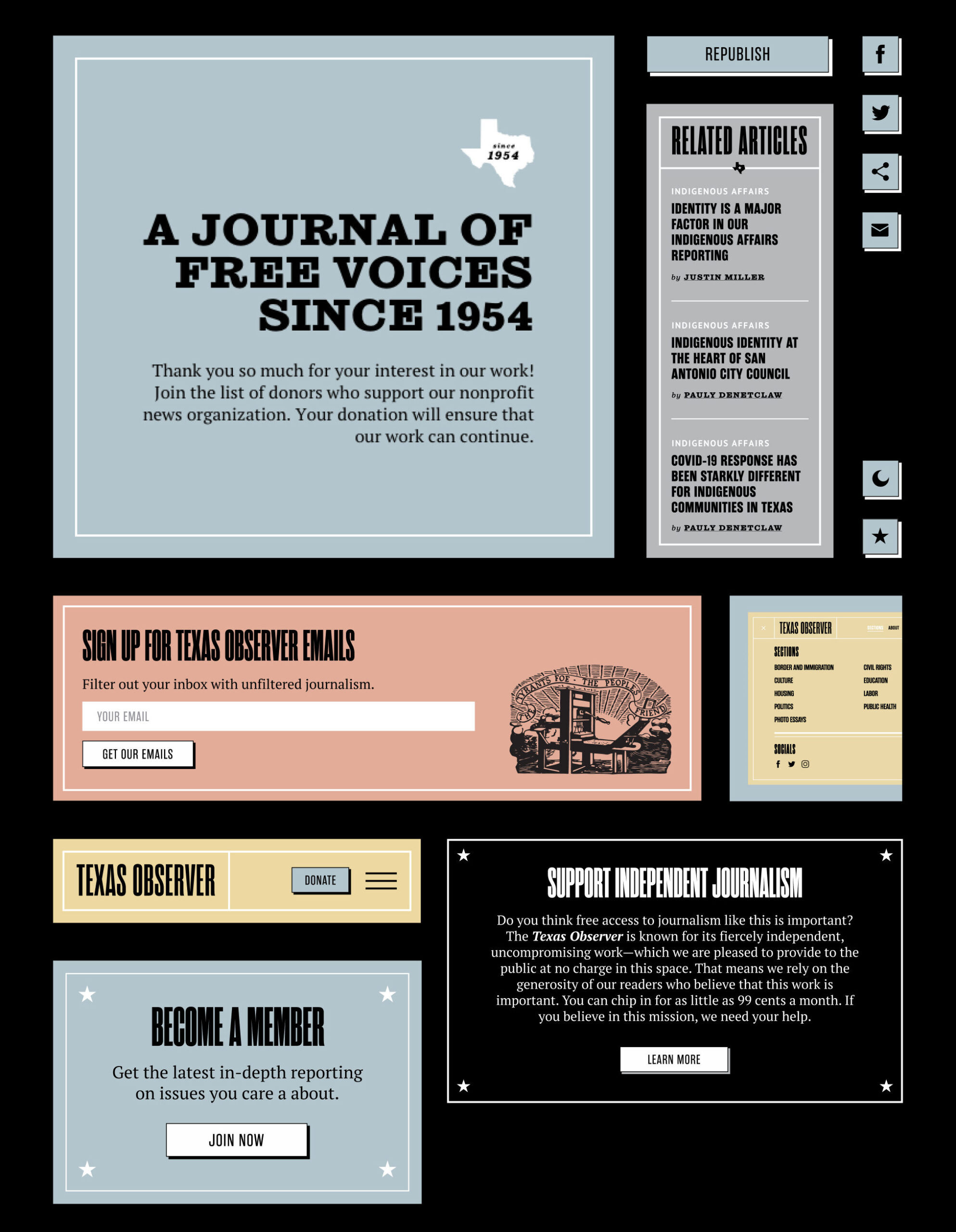
And last, but certainly not least, we made sure to integrate their subscription and donation vendor tools, managed by Pico, more deeply into the site than they had ever been before. Moving away from pop-ups and redundant forms disconnected from page content, we built a series of custom blocks that for the first time ever allowed users to engage with the donation and membership process directly on the Observer site, helping the user experience to become more concise and cohesive.